Main Title Sequence

Holland
The Concept
In Picturemill’s second collaboration with director Mimi Cave for Prime Video, the main title sequence design for Holland draws inspiration from the Netherlands’ idyllic aesthetic of small-town life with a touch of dark psychological tension simmering beneath the surface.
The concept centers around the nation’s iconic landscapes and historical aesthetics, aiming to immerse viewers in a visual narrative that reflects Dutch identity. An analog, miniature world full of trains, windmills, tulips, and traditional architecture was built to create an atmosphere reminiscent of classic Dutch paintings, setting the tone for the story that unfolds.
The Process
Staying quiet in a small town.
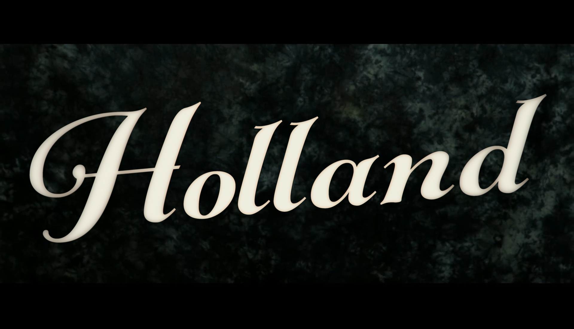
The development began with intensive research and visual exploration of the Netherlands, digging into old photography, landscaping techniques, and organic film textures. Each shot was built to suggest deeper themes: isolated objects, blurred motion, and shifting light representing emotional fragmentation and hidden truths. The typography was carefully treated to blend naturally into the environment—never overpowering, but always present—echoing the characters’ attempts to quietly exist in a town full of secrets.


The Impact
Upon release, the main titles quickly drew praise for their haunting beauty and sophisticated restraint.
Critics and audiences alike recognized how the sequence served as a quiet prologue to the film’s emotional journey, setting the mood before a single line of dialogue was spoken. More than just aesthetic, the titles enhanced the storytelling, foreshadowing the narrative’s psychological layers and immersing viewers in the world of Holland from the very first frame. As a standalone piece of design, the sequence became a defining part of the film’s identity—evocative, memorable, and mysterious.
